
Guiding Design Approach
I created a concept sketch to guide the designer’s work, establishing flow, hierarchy, and sense of scale. OIDO's process acts as the funnel to gather data that identify systemic detention issues to facilitate ongoing improvements. Numbered stages establish the at-a-glance understanding, where smaller text blocks provide the deeper, detailed content.
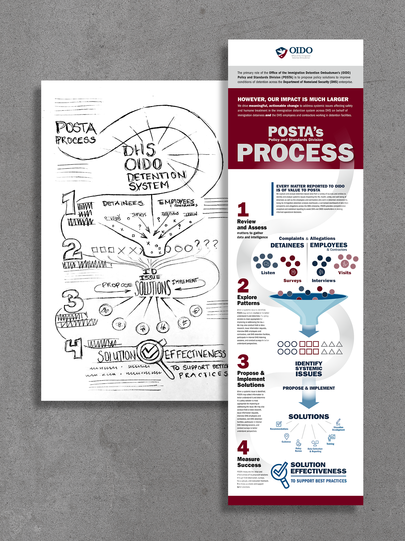
Online Process Infographic, 2022
Video Art Direction—Essential Communication
Audio might be turned off in detention facility communal areas. Captions might not match a detainee's language. I established the visual direction and worked closely with the motion artist on timing, icons, and yellow emphasis to help essential information get through. The closing hummingbird moves through OIDO’s letters—representing OIDO as a helper and guide.
Communities and advocates needed to understand where OIDO could help—and where its responsibilities ended. Within a fixed runtime, I guided image framing, transitions, and key-word emphasis. The moving line had a job throughout: focus attention, connect ideas, and keep the explanation moving. I worked with the production team to plan the shoot, shaping the shot list, timing, and shot rationale around the motion artist’s needs.
Key contributor to voice talent and music track selection to support the tone and message.

OIDO case managers offer detainees help while in detention
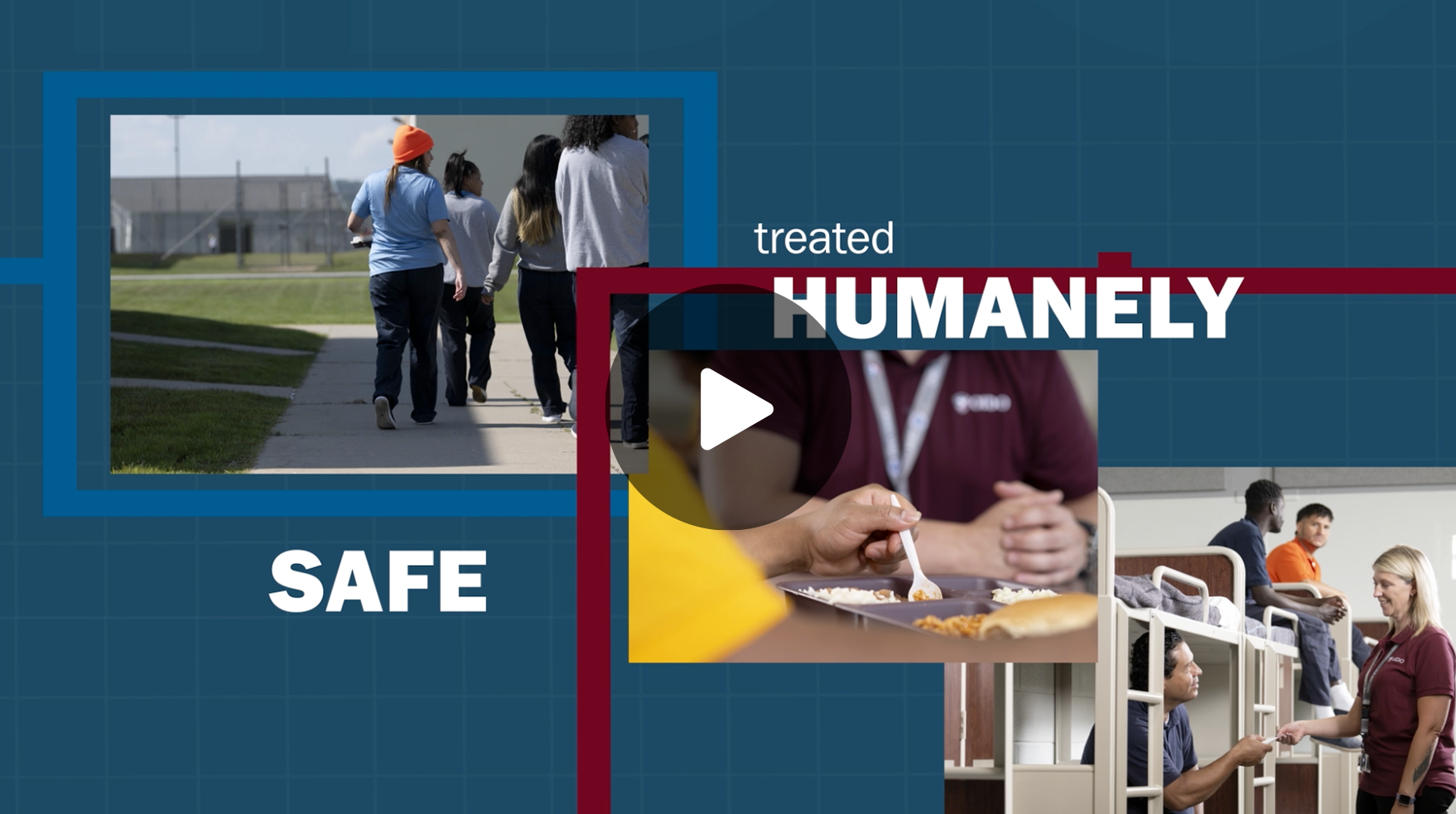
Understanding OIDO’s role
Making Compltexiy Accessible
Billions in funding can be hard to connect to everyday life. This infographic brings the investment, spending priorities, and reported benefits into one view. Large figures establish scale; comparison bars show where supplemental funds went; illustrations anchor providers and families in the financial story.

American Rescue Plan — Child Care Investment
Commissioned Icon System
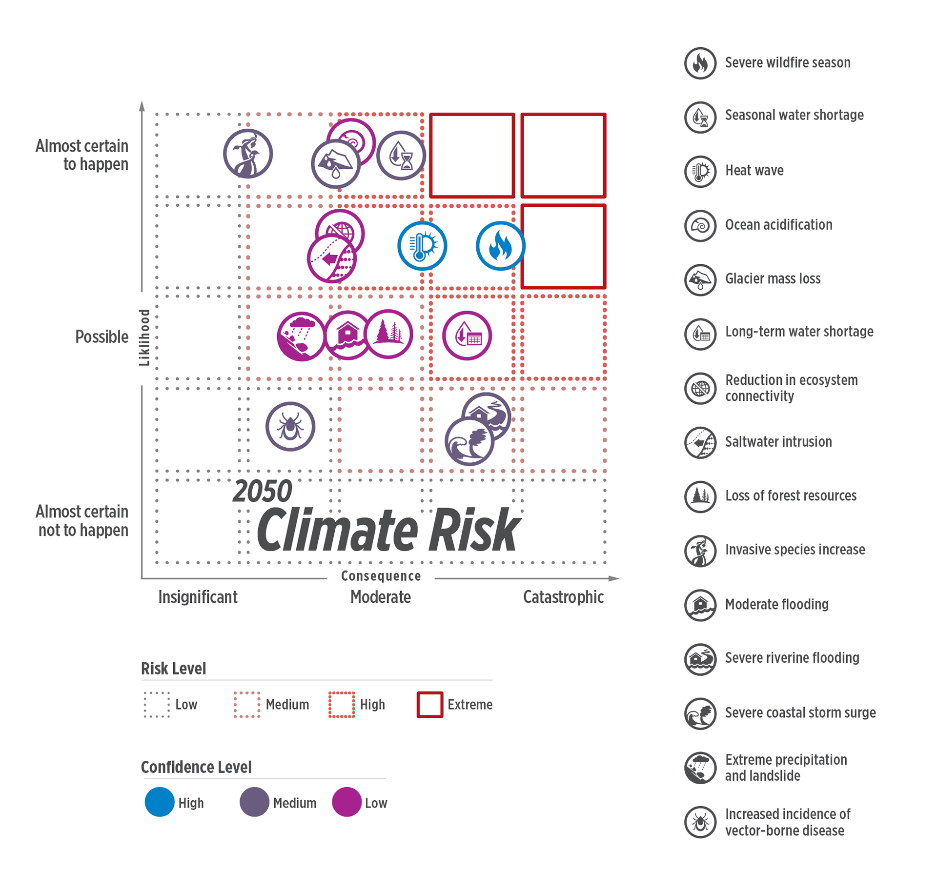
Helping British Columbia provincial decision-makers compare climate risks and establish priorities.
The challenge was to give15 different climate threats a consistent visual language while keeping each recognizable. I developed the custom icon system for the risk assessment report, then independently explored the application below: streamlining x- & y-axis labeling, establishing border distinctions beyond color, and bringing the icon key into the same view so readers could identify and compare threats without referencing a separate page.
Personal Projects
ASMR (Autonomous Sensory Meridian Response) Appeal
ASMRtists' videos sharing their auditory munching experience has become a global viral phenomenon. This packaging concept channels the ASMR spirit by marketing freeze-dried fruit snacks as satisfyingly crisp. A "noisy" snack tagline delivers personality and potential for humor in the brand's storytelling. Vibrant berries against white impart visual "crispness" for a wholesome treat.

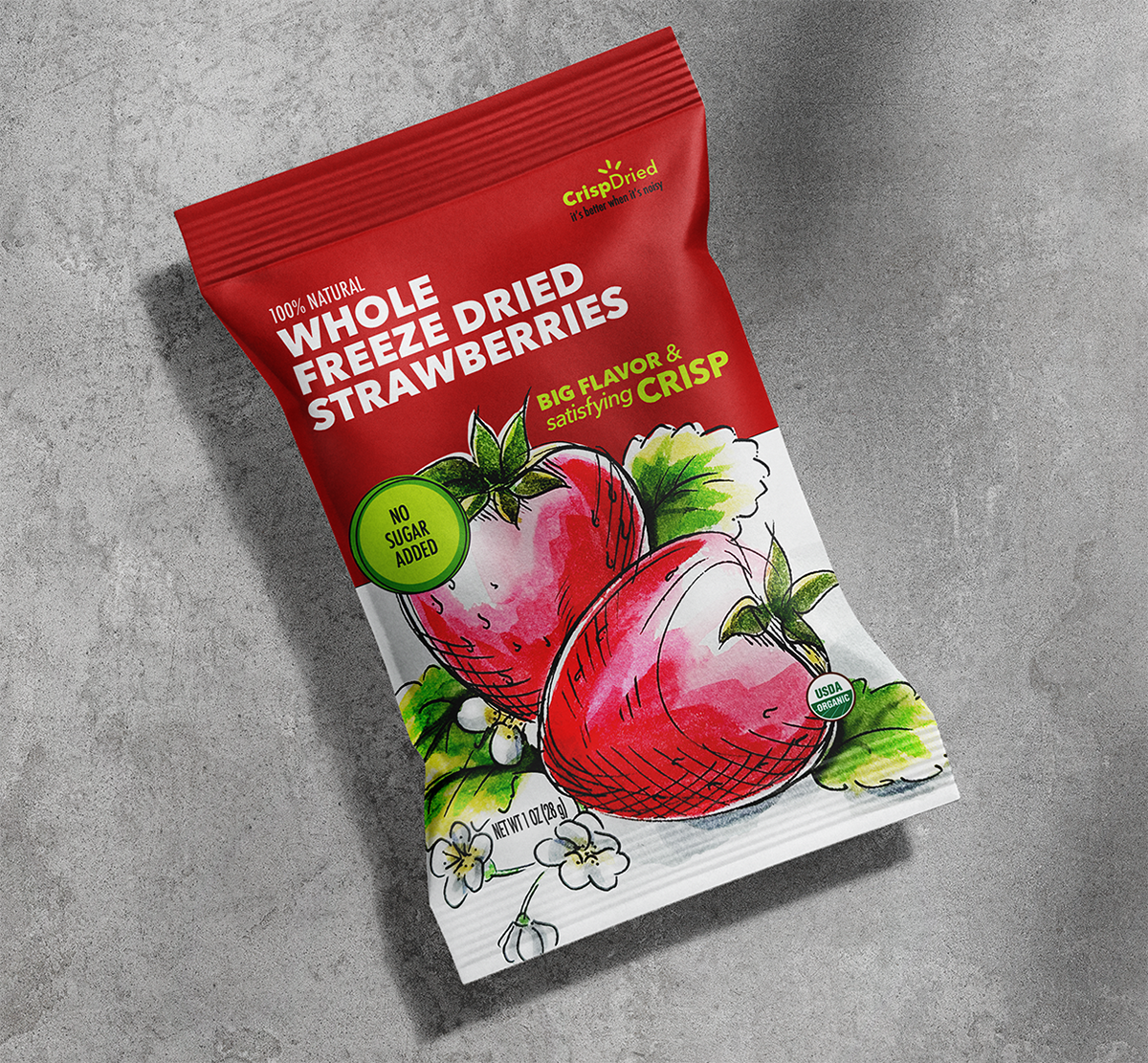
Hand-drawn Marker Brush
Elevating Botanically Infused Wine
The visual treatment was inspired by reference images of vintage cobalt lace dishware known for intricate floral designs and blue-white contrast. I used my ink doodle pattern for linear elements. The natural blending of watercolor delivers a botanical vibe and handcraft appeal.
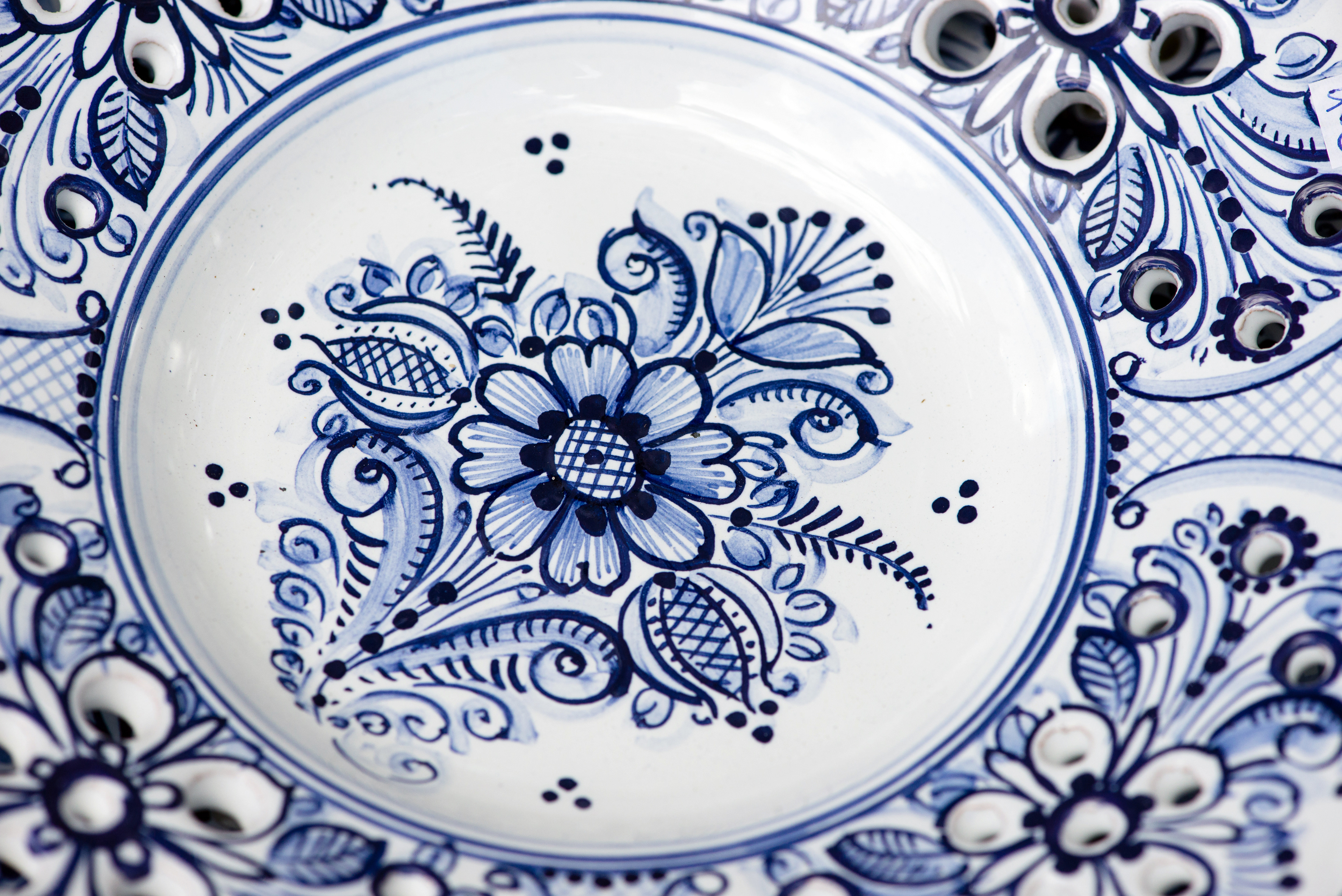
Vintage Ceramic Inspiration
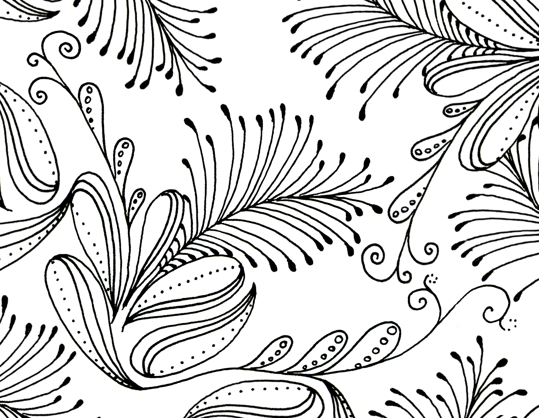
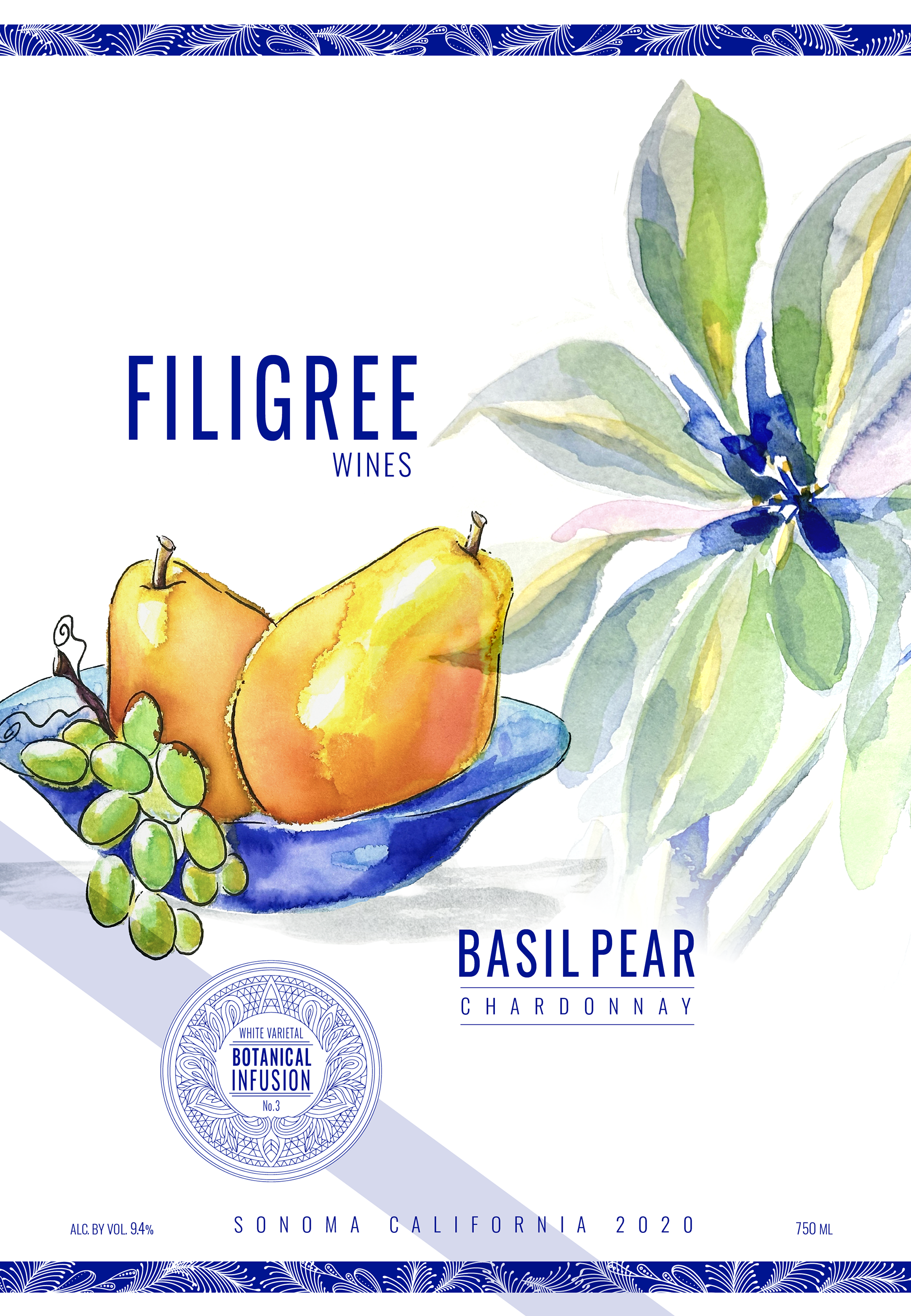
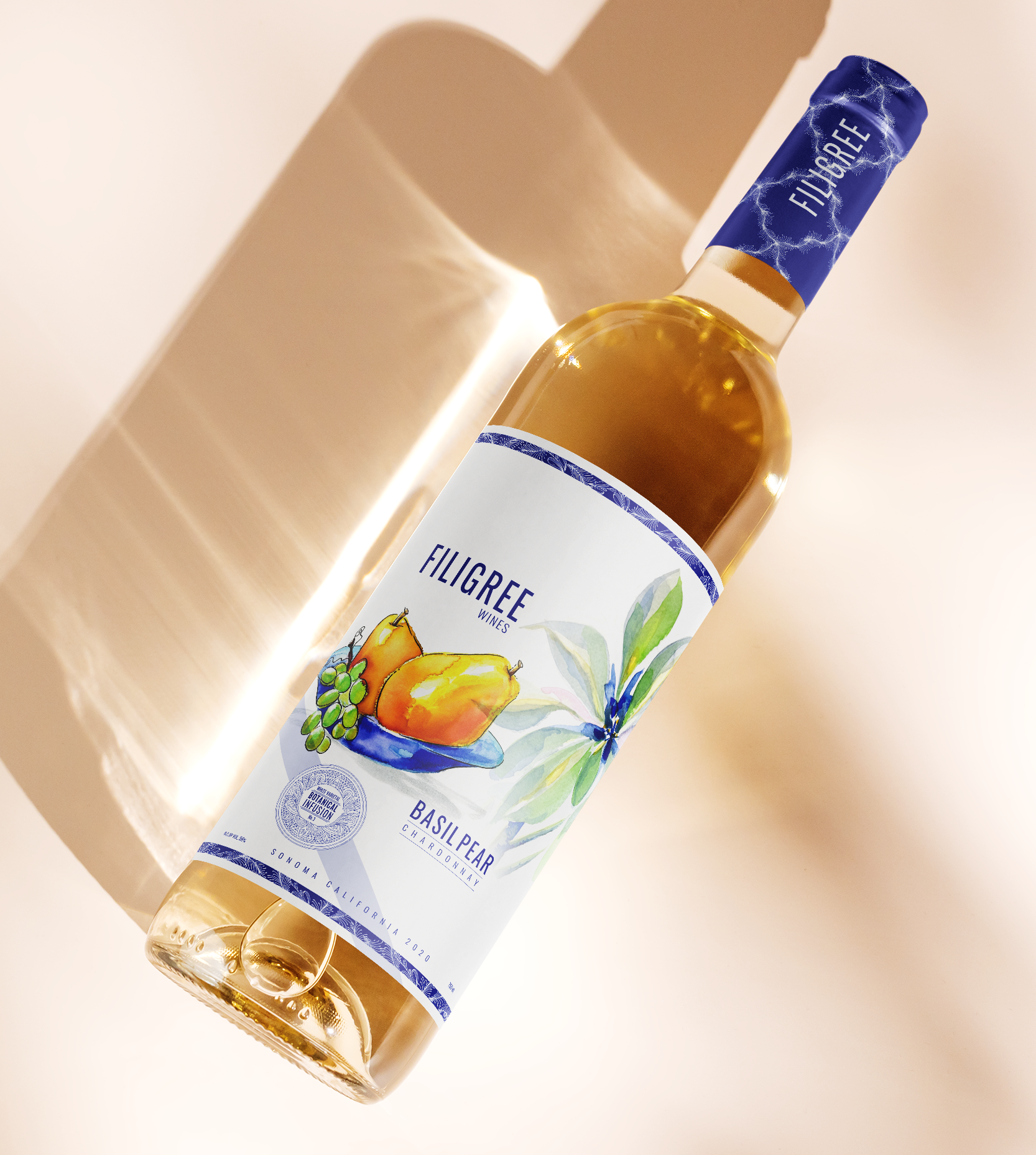
Ink doodles + hand-painted watercolor
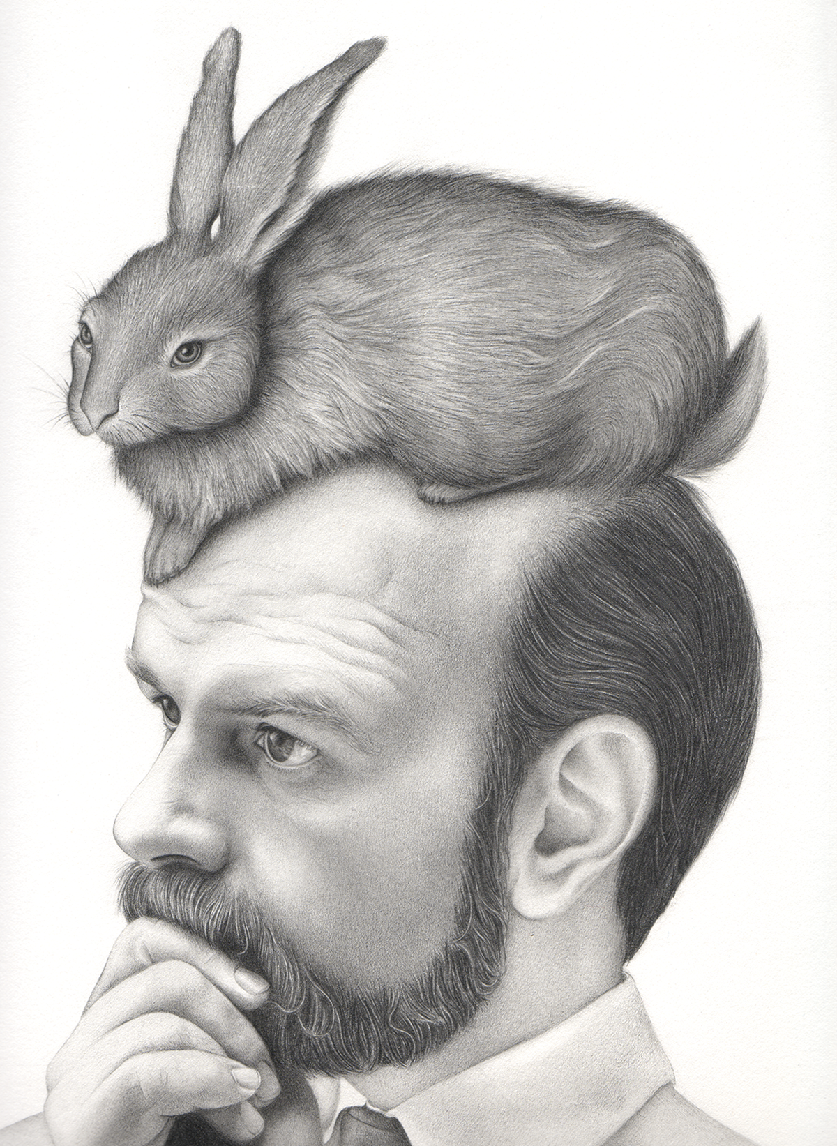
Hand-drawn graphite
"Hare" Piece
A hare perched upon a man’s head—an editorial visual pun inviting contemplation of the sometimes absurd lengths we go to in the name of vanity. I brought separate references together for an original composition where tonal control and convincing rendering serve the joke.